25 posts tagged with "content"

View All Tags

· 9 min read
Martijn Smit

Developer desktop analytics scene with editor, browser, terminal, chat windows, keyboard heatmaps, and activity graphs

Developers usually spend their time across a few repeating modes: editor work, browser research, terminal bursts, communication, and the occasional build or review cycle. The useful question is not how many hours sat in a chair. It is which computer activities filled those hours, and whether the mix matched the job you thought you were doing.

If you want the short answer, a developer computer day usually shows up as a mix of application usage, website visits, keyboard activity, mouse activity, and uptime. That combination tells you whether you were building, debugging, reading, reviewing, coordinating, or just leaving the machine awake while life happened elsewhere.

· 8 min read
Martijn Smit

WhatPulse safety checklist illustration with a dashboard, shield, and export controls

Yes, for most people using it as designed, WhatPulse is safe. It is a personal activity tracker, so the real question is whether you are comfortable recording counts for keyboard, mouse, application, website, uptime, and related stats. If you review the privacy settings, decide which data you want to collect, and keep exports and backups under your control, the setup stays straightforward.

That is the short answer. The longer answer is more useful. A safety check for tracking software should ask four things. What data does it collect, who can see it, how easy is it to export or remove, and can you turn off the parts you do not want. WhatPulse gives you enough knobs to make those decisions without turning the whole thing into a hobby in itself.

· 9 min read
Martijn Smit

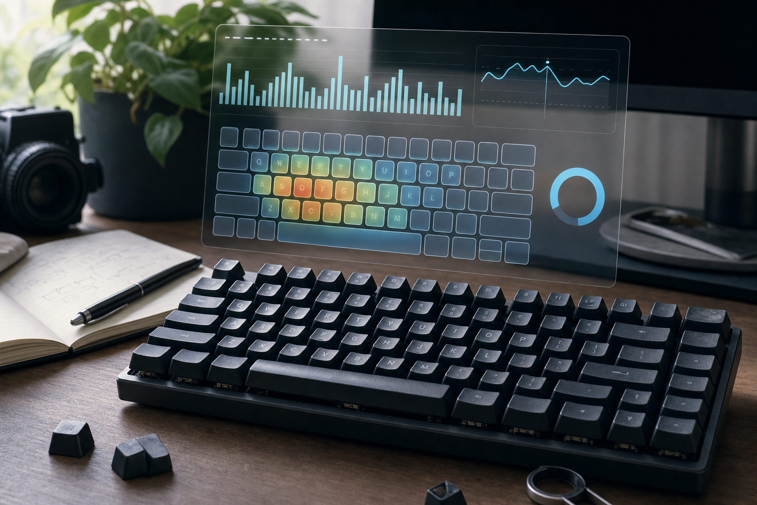
Keyboard lifespan illustration with wear marks and a daily keystroke dashboard

Keyboard lifespan is usually measured in parts, not in one dramatic collapse. Mechanical switches are often rated in tens of millions of presses per key, so a normal user can get years of use before switch wear becomes the main problem. Keycaps shine, stabilizers loosen, batteries age, cables fail, and dirt gets in the way long before the whole board gives up.

The useful question is simple: how much typing do you actually do? If you know your average daily key count, you can estimate how long a keyboard will last, spot which parts are wearing first, and decide whether you need cleaning, repair, or replacement. WhatPulse helps because it turns that guess into a record.

What actually limits keyboard lifespan​

· 9 min read
Martijn Smit

A distracting application is one that keeps pulling your attention away from the task you meant to do. The useful test is simple: if it shows up in short, repeated bursts, interrupts a clear work session, or appears when your output drops, it deserves a closer look. WhatPulse helps you find those patterns by comparing application usage across days, hours, and contexts, so you can review evidence instead of guessing which app is stealing time.

If you want the short version, start with your app list, compare weekdays with weekends, and look for applications that appear often but contribute little to the work you were trying to finish. Then check whether those apps line up with web browsing spikes, lower typing activity, or long idle stretches. That gives you a practical signal without turning the whole exercise into a moral trial for your desktop.

What counts as a distracting application​

The phrase sounds subjective until you define it with behavior. A distracting application is usually one of three things:

  1. An app you open often, but use for very short sessions.
  2. An app that appears during work blocks where you expected sustained focus.
  3. An app that clusters around low output periods, context switches, or end of day drift.

That definition matters because some applications look busy and some feel busy. Those are different things. A chat client, a browser tab jungle, a launcher, a game client, or a news reader can all steal attention in different ways. A quiet utility that runs all day may look important and still contribute almost nothing to your actual workflow.

WhatPulse works best here because it lets you compare measurable application usage instead of relying on memory. You can inspect application stats, compare them with website stats, and check whether the same periods also show unusual activity patterns. That combination is more useful than a vague feeling that “today was scattered.”

Build a seven day baseline before you judge anything​

One day of data is mostly weather. Seven days gives you enough variety to see how your computer behaves across a normal workweek. If you can stretch it to fourteen days, even better. The point is to measure your baseline before you start removing things, hiding things, or declaring war on a browser tab that happened to open at the wrong moment.

During the baseline period, keep your setup normal. Use your usual browser profile, your normal apps, your regular work routine, and your standard gaming or leisure habits. Do not optimize the system while you are still learning how the system behaves.

Then review these patterns:

  1. Which applications appear every day.
  2. Which applications appear only on certain days.
  3. Which apps show up in short bursts rather than long sessions.
  4. Which apps cluster before lunch, after lunch, or late in the day.
  5. Which apps coincide with low keyboard activity or heavy website switching.

That last point is where the data starts to get interesting. An app does not need to dominate your total time to be distracting. Repeated reentry can be more disruptive than one long planned session. A tool that you open twelve times for thirty seconds each is worth more attention than a tool you keep open while doing real work.

Sort apps into keep, watch, or cut​

Once you have a baseline, stop asking whether an app is good or bad. That question is too abstract and too dramatic. Ask what role the app actually plays.

Here is a practical checklist for the review:

  1. Does the app directly support work, study, gaming, or another deliberate task?
  2. Does it appear in predictable blocks, or does it keep interrupting the day?
  3. Does it require an active decision to open, or does it launch because of habit?
  4. Does it pair with strong output, such as typing, coding, editing, or finished work?
  5. Would your day change meaningfully if you removed it for one week?
  6. Does it connect to a clear purpose, or does it exist because it has always been there?

Use the answers to sort each app into one of three buckets:

  1. Keep. The app supports a task you care about, and the usage pattern looks intentional.
  2. Watch. The app may be useful, but the timing or frequency suggests it deserves a second look.
  3. Cut. The app shows up often, consumes attention, and has little evidence of real value.

You do not need perfect certainty. You need enough evidence to make the next week slightly better than the last one.

Use patterns, not guilt​

A lot of people abandon this kind of review because they try to turn it into a productivity sermon. That is a fast way to make the data useless. The point is not to shame yourself for using a messaging app, a game launcher, or a browser tab that exists because modern work asks strange things of human beings.

A better approach is to ask where attention leaks actually happen. For example:

  1. Does a work app create a long tail of notifications that keeps pulling you back?
  2. Does a browser session begin as research and end as a chain of unrelated tabs?
  3. Do you open a game client or streaming app during the same low energy window every day?
  4. Do certain applications always appear right after meetings or before shutdown time?

Those are patterns you can work with. Once you know them, you can change defaults. Move a noisy app off the dock. Close a browser profile at lunch. Reorder your taskbar. Separate work and personal windows. Archive the software you only open because it still happens to be there.

That last one matters more than people expect. Software clutter is often just memory with a download button.

Compare app usage with other signals​

An application rarely tells the whole story by itself. It becomes more useful when you compare it with the rest of your activity history.

A few helpful combinations:

  1. Application usage plus website usage. If both climb at the same time, you may be bouncing between tools rather than finishing work.
  2. Application usage plus keyboard activity. A lot of app switching with very low typing often points to review, scanning, or distraction rather than production.
  3. Application usage plus uptime. A long session with little input can mean passive background time, not real engagement.
  4. Application usage plus the time of day. The same app may be harmless in the morning and destructive late in the afternoon.

This is where WhatPulse becomes useful as a habit lens rather than a scoreboard. You can move from “I used this app a lot” to “I used this app a lot during the part of the day when I was least effective.” That is a more specific question, and specificity usually saves time.

What to do after you identify the problem apps​

The fix should be small enough that you will actually keep it.

Try one of these changes:

  1. Put distracting apps on a second desktop or out of the main dock.
  2. Turn off automatic launch for tools you rarely need.
  3. Make one browser profile for work and one for everything else.
  4. Close the app after use instead of leaving it open as background noise.
  5. Review the same three apps every week until the pattern stabilizes.

You do not need a total reset. You need a habit that makes the next review easier than the last one. If an app is still useful after a week of deliberate tracking, it probably belongs in your workflow. If it keeps surfacing in the wrong place at the wrong time, that is useful information too.

A practical weekly review in ten minutes​

If you want a repeatable process, use this once a week:

  1. Open your application usage view.
  2. Look at the top apps for the last seven days.
  3. Mark the ones that were clearly intentional.
  4. Mark the ones that only appeared during drift, boredom, or context switching.
  5. Compare that list with website usage and uptime.
  6. Pick one app to keep, one to watch, and one to cut or constrain.
  7. Make a single change before the next week starts.

That is enough. You do not need a monthly tribunal for every window on your machine. You need one small review loop that turns vague annoyance into a concrete adjustment.

A note on breaks, focus, and ergonomics​

If your app review keeps showing long stretches of scattered behavior, the issue may be workload shape rather than willpower. Short breaks, posture changes, and a better task sequence can matter as much as any app cleanup.

The CDC ergonomics guidance is useful if your sessions are long and repetitive. For the cognitive side, research on task switching shows that interruptions carry a real cost. One frequently cited overview in PubMed describes the speed and stress penalty that comes with interruption heavy work. If you use Apple Screen Time or Windows app tools alongside WhatPulse, the comparison can make those patterns easier to see.

The point is not to eliminate every interruption. The point is to know which interruptions you chose and which ones just arrived because the day had no guardrails.

Review the evidence, then move on​

Distracting applications are usually easier to fix once you stop treating them as a personal flaw. They are a pattern. Patterns can be measured, compared, and adjusted.

Start with a baseline, review your application usage once a week, and compare it with websites, uptime, and input activity. Keep the apps that do real work. Watch the ones that only look busy. Cut the ones that keep stealing attention without paying rent.

The data will not make decisions for you, which is fortunate. It only makes the bad guesses harder to defend.


· 10 min read
Martijn Smit

A personal activity dashboard is useful when it gives you a clear view of how you actually use your computer: time active, keys pressed, clicks, applications used, websites visited, uptime, and network activity. The point is to replace vague feelings with measurable signals.

For WhatPulse users, that review starts with data your computer can already measure. WhatPulse gives you three static dashboards — overall, productivity, and rankings — plus detailed stats for keyboard, mouse, applications, websites, uptime, and network behavior. Together, they give you a practical personal analytics system that shows where your computer time goes and which routines deserve attention.

What your activity dashboards should answer​

Good activity dashboards answer questions you can act on. Start with the decisions you want the data to support.

Useful questions:

  • Which days have the most active computer time?
  • Do heavy typing days line up with writing, coding, or chat-heavy work?
  • Which applications dominate my work sessions?
  • Which websites appear most often during unfocused periods?
  • Do long uptime periods correlate with missed breaks or late shutdowns?
  • Does network usage spike during backups, downloads, streaming, or game updates?

This framing matters because personal analytics can drift into trivia. WhatPulse has plenty of satisfying numbers for that. Activity data becomes useful when each number has a job.

For example, total keystrokes can be a curiosity metric. Keystrokes by day can reveal when you write, code, message, or game most intensely. Mouse clicks can be a fun annual stat, as covered in Mouse Click Statistics: What Your Daily Clicks Reveal. Clicks by session can also show which tools create constant interaction and which workflows stay calmer.

Pick metrics that map to real behavior​

The best personal activity dashboard uses a small set of signals that describe different parts of computer use. Avoid trying to compress everything into one productivity score. That usually hides the interesting parts.

QuestionUseful metricWhat it can showWhat to avoid
When am I active?Active computer timeWork rhythm, long sessions, quiet daysTreating time online as output
How much do I type?Keys per day or sessionWriting, coding, chat, documentationComparing raw counts across different kinds of work
How pointer-heavy is my day?Clicks and scrollsDesign, gaming, browsing, admin workAssuming more clicks means more value
Where does time go?Application usageMain tools, context switching, app sprawlUnsupported category labels
What grabs attention?Website usageRepeated visits, research patterns, distractionsCalling every visit wasteful
How healthy is the machine routine?Uptime and restartsAlways-on machines, missed shutdownsTreating uptime as discipline
What uses bandwidth?Network usageUpdates, sync tools, streaming, downloadsGuessing source without checking apps

This table is also a filter. If a metric does not help answer a question, leave it out of the main view. You can still keep the raw data for later curiosity. Dashboards work because they reduce the number of decisions you need to make while reviewing a week.

Review your activity in four passes​

Start with four review passes. They cover most computer habits without turning your stats into a maintenance project.

1. Daily rhythm​

Your daily rhythm review should start with active computer time, keys, clicks, and major usage spikes by day. It answers the most basic question: when was the computer actually being used?

Use this view to spot patterns such as:

  • Monday has long activity time but low typing.
  • Wednesday has fewer hours and a high keystroke count.
  • Friday includes a late session that pushes activity past the usual shutdown time.
  • Weekend activity is mostly gaming or browsing.

Keep this pass simple. A day-by-day comparison is enough. If you need a practical starting point, the recent guide on using a computer usage tracker without overthinking it explains how to review computer activity without turning it into another task list.

2. Input intensity​

Input intensity combines keyboard and mouse behavior. It shows the shape of work rather than the topic of work.

High keyboard activity often points to writing, coding, support replies, documentation, or chat. High mouse activity often appears during design, games, spreadsheets, browsing, and tools with dense interfaces. Neither signal is better. They describe different kinds of interaction.

This pass works well as a weekly comparison. Focus on three indicators:

  • Total keys
  • Total clicks
  • Peak input day

The important pattern is the relationship between input and time. A day with two active hours and a large number of keys may represent focused writing. A day with ten active hours and low input may mean meetings, video, monitoring, or background time. Your review should make those differences visible without forcing a conclusion.

3. Attention map​

The attention pass shows applications and websites. Keep it literal: applications, windows, processes, and visited websites. Do not invent categories unless the underlying product data supports them.

This pass answers practical questions:

  • Which applications appear every day?
  • Which tools only show up during project work?
  • Which websites recur during breaks?
  • Which sites appear during research periods?
  • Which apps stay open long after they are useful?

A website usage tracker can help here, but the interpretation needs care. A documentation site can be deep work for a developer. The same browser can hold a code review, a streaming tab, and a payroll tool. The post on using a website usage tracker without overreacting is a useful companion because it treats website data as context, not a moral scoreboard.

For a weekly review, look at top applications and top websites, then add a short interpretation note for yourself. A chart can tell you that a site appeared often. Your note explains whether it was research, admin work, procrastination, or something else.

4. System load and continuity​

The fourth pass covers uptime and network usage. These metrics are easy to ignore because they feel less personal than keys or websites, but they often explain the rest of your activity data.

Long uptime can reveal always-on machines, forgotten restarts, remote boxes, or gaming rigs that never fully shut down. Network usage can explain why a day felt slow, why a laptop battery drained, or why a short session produced a large data spike.

Use this pass to catch practical issues:

  • Sync tools moving large files during work hours
  • Game launchers downloading updates in the background
  • Video calls or streams dominating network traffic
  • Long uptime periods before performance drops
  • Machines that stay active outside planned hours

The public WhatPulse stats page is useful for community-scale curiosity, while your own review should stay focused on personal patterns. Comparing both can be fun, but your computer habits only need to improve relative to your own baseline.

Review your dashboards once a week​

Daily checking can make activity data noisy. Weekly review gives patterns time to form. Set a 10-minute review window and ask the same questions each time.

Use this checklist:

  • Did active time match what I remember from the week?
  • Which day had the highest keyboard activity, and why?
  • Which day had the highest mouse activity, and why?
  • Which applications dominated planned work?
  • Which applications or websites appeared more than expected?
  • Did any late sessions repeat?
  • Did network usage or uptime explain slowdowns or distractions?
  • What is one setting, routine, or habit to test next week?

The last question keeps the review useful. The goal is one small experiment, not a complete personality rewrite. You might close a distracting site after 8 p.m., schedule large downloads outside working hours, move writing to the morning, or shut the computer down after a gaming session.

The next week, check whether the experiment shows up in the data. If it does, keep it. If it does not, adjust it. Quietly ruthless, just with graphs.

Example review patterns​

A developer might track active time, keys per day, code editor usage, terminal usage, documentation websites, late sessions, and network spikes from package installs. A gamer might track session length, clicks, keyboard intensity, launcher downloads, weekday versus weekend activity, and uptime around long sessions.

A remote worker might track active workday time, meeting-heavy days with low input, communication tools, repeated admin apps, research websites, and shutdown time. A keyboard enthusiast might track keys per day, peak typing sessions, layout changes, heatmap-style key use, typing-heavy applications, and month-over-month comparisons.

These examples show why one universal score is too blunt. A good day for a developer, a gamer, a designer, and a support lead can produce very different input patterns. Your review should preserve those differences.

Common mistakes to avoid​

The first mistake is tracking too much. If the weekly review takes effort to read, it will become another abandoned task. Start with daily rhythm, input intensity, attention, and system continuity.

The second mistake is treating activity as productivity. Activity is evidence of computer use. It can support a productivity review, but it cannot measure judgment, creativity, quality, or whether a meeting should have been an email. Some meetings haunt the data less than they haunt the soul.

The third mistake is ignoring context. A spike in website visits might be distraction, research, QA testing, or comparing documentation. Notes make charts more honest.

The fourth mistake is chasing perfect data. Personal activity reviews work best as trend tools. A weekly pattern matters more than a perfectly classified minute.

Start with one baseline month​

Before changing habits, collect a baseline. Thirty days is enough to see weekday patterns, weekend differences, heavy input days, quiet days, and recurring website or application behavior. It also gives you a fairer comparison when you test a new routine.

After a month, write down five observations:

  1. My most active day is usually ____.
  2. My highest typing days happen when ____.
  3. My highest click days happen when ____.
  4. The applications or websites I want to review are ____.
  5. One habit I want to test next month is ____.

That small summary turns raw activity into self-measurement. Personal activity dashboards do not need to tell you who you are. They need to show what your computer habits are doing often enough that you can choose what to change next.

If you already use WhatPulse, start with the overall dashboard and pick one weekly question. Then check the productivity and rankings dashboards only when they help answer that question. If you are new, begin with the public WhatPulse help center and the main dashboard after setup. Keep the review small, repeat it consistently, and let the data earn its place.