
We've spent the last few weeks reworking the Productivity dashboard, and if there's one thread running through all of it, it's control. You could already see where your time went. Now you get to decide what counts, clean up the view, and trust that the headline numbers match the way you actually work.
Here's everything that changed.
Read on for the textual version, or watch the video for a quick overview:
Apps and websites, finally in one place
Your applications and the websites you visit used to live in two separate tables, split behind a toggle. It never quite made sense, since they're both just things you spend your day on. So we merged them.
The new Applications & websites table puts everything in one list. You can search across apps and websites at once, sort by time, keys, clicks, or any other column, and page through the whole thing without flipping between tabs. Each row is tagged Productive or Not productive, so a quick glance tells you what's earning its keep and what's quietly eating your afternoon.
Website names now link straight to their profile page as well, and they open in a new tab so you never lose your spot in the list.
Your call on what counts as productive
This is the part we're most happy with. WhatPulse comes with a sensible default for whether an app or website is productive, based on how the wider community classifies it. But productive is personal. YouTube is a time sink for one person and an actual job for another.
So now you can override it. Open the dropdown on any row and choose one of three things:
- Productive
- Not productive
- Default, which just follows the global setting
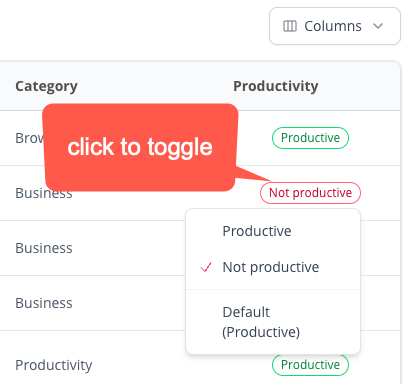
Your choice is yours alone. It doesn't change anything for anyone else, and it sticks around. Best of all, this works for websites now, not just apps, so you can finally mark your one "research" site as productive and your one "just a quick break" site as, well, not.
Show only what you want to see
More data is not always better. Some of you really do want scrolls and mouse distance broken down per app. Most of you would happily never see them again.
So the table has a Columns button now. Click it and you get a simple checklist of every column, ready to switch on or off. Scrolls and distance start out hidden, but they're one click away whenever you want them. Turn off what you never read, and keep what you do.
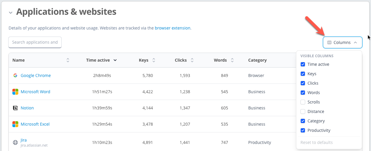
Two small touches we're fond of:
- Your layout is remembered. Set it up once and it looks exactly the same the next time you open the dashboard, even after a refresh.
- Columns fade gently in and out as you toggle them, so the table never jumps around while you tidy it.
None of this changes your data. It just makes the page feel calmer and more like yours.
Try it
All of this is live on your dashboard right now. Open the Productivity page, pick a week with a good mix of focused work and happy distraction, and spend a minute tuning it to match how you actually spend your time.
Track it, tune it, and finally see where your time really goes.
Open your Productivity dashboard