· 10 min read
Martijn Smit

A calm desktop analytics dashboard showing website visits, time blocks, and browser activity patterns

A website usage tracker helps you see which sites pull your attention, when they appear in your day, and whether those visits match what you meant to do. The useful version is simple: measure websites, compare patterns, change one habit, then check the next week. You do not need moral labels for every domain or a minute by minute confession booth. You need enough evidence to answer practical questions like “Where did the afternoon go?” and “Which sites keep interrupting focused work?”

Website data gets useful when you treat it as activity context. A news site at lunch says something different from the same site opened twelve times during a coding block. A documentation site during a bug fix says something different from a shopping tab that keeps reappearing after every hard task.

The goal is to build a small measurement loop around browsing habits: collect website visits, group them by time and intent, choose one adjustment, and review the result later.

What a website usage tracker should tell you

A good website usage tracker answers four questions without demanding a new hobby:

  1. Which websites show up most often?
  2. When do they appear during the day?
  3. How do those visits line up with keyboard, mouse, and application activity?
  4. Which pattern is worth changing first?

That fourth question matters most. Raw browsing history already exists in your browser. Chrome explains how to view and manage history in its Chrome history help, and Mozilla documents the same idea for Firefox in its guide to deleting browsing and search history. Those tools tell you what happened inside one browser.

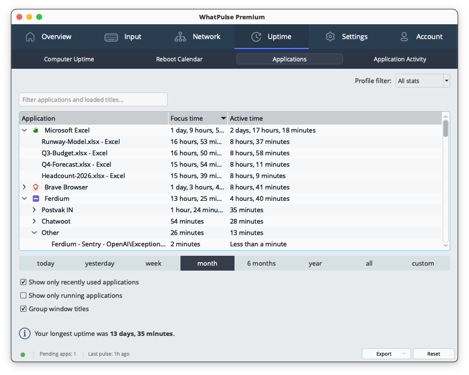
A usage tracker becomes more useful when it connects the website list to the rest of your computer day. WhatPulse users can compare website activity with broader public and personal patterns through pages like WhatPulse website stats, application stats, and uptime stats. That combination helps separate casual browsing from repeated context switching.

The point is not to assign blame to a URL. The point is to make invisible patterns visible enough to act on.

Start with a one-week baseline

Do not start by blocking half the internet. Start with a baseline week.

A week gives you five workdays, a weekend, and enough variation to avoid reacting to one strange Tuesday. During the baseline, avoid changing your setup. Keep your browser, applications, and work routine normal. If you change everything while measuring, you will learn that changing everything changes everything. Very useful, if your main research goal is circularity.

At the end of the week, look for these signals:

  • Top websites by visits or active time
  • Repeat visits during planned focus blocks
  • Sites that appear after meetings, deploys, support tickets, or long gaming sessions
  • Differences between weekday and weekend browsing
  • Domains that look necessary but may hide a lot of idle checking

Use the baseline to pick one measurable question. Examples:

  • “Do I open social sites more often after 3 p.m.?”
  • “Does documentation browsing happen in long research blocks or constant fragments?”
  • “Which entertainment sites appear during work hours?”
  • “Do I browse more on days with low keyboard activity?”

One question keeps the review useful. Ten questions turn the review into a spreadsheet swamp with browser tabs.

Use website data with keyboard, mouse, and app activity

Website usage makes more sense when you read it beside other activity signals.

A website visit alone can mislead. A documentation tab might sit open while you work in an editor. A video page might be background audio. A project management site might be active work or avoidance with excellent branding. Keyboard and mouse activity help add context.

For example:

  • High keyboard activity plus documentation sites often points to active problem solving.
  • Low keyboard activity plus frequent social visits may point to passive checking.
  • High mouse activity plus dashboards may point to review work or admin tasks.
  • Uptime without input activity may mean the computer was on while you were away.

WhatPulse is useful here because it tracks computer activity over time, not just browser events. You can use the WhatPulse homepage as the product entry point, then compare browsing patterns with stats that show how your computer use changes across days. The WhatPulse help center is also a safer internal link than invented feature pages, which saves everyone from the quiet misery of 404 archaeology.

This combined view keeps the analysis grounded in behavior you can control. You are measuring applications, websites, input activity, network usage, and uptime signals. You are not trying to infer your entire personality from a domain list.

Decide what the pattern means before you change it

A top website is not automatically a problem. Some sites are central to the work.

Use this decision table before making changes:

PatternLikely meaningUseful next step
High visits, high keyboard activity, mostly during planned workActive research or communicationLeave it alone; maybe bookmark repeated resources
High visits, low input activity, repeated across the dayPassive checking or background consumptionSet two planned check windows for one week
Short visits after difficult tasksRecovery habit or task avoidanceAdd a small break ritual before reopening work
Heavy weekend use, light weekday useLeisure patternTrack separately from workday attention
Long sessions on learning sitesTraining or deep researchCompare with notes, commits, tickets, or outputs
Many sites opened at once each morningStartup routine or tab clutterCreate a smaller launch set and review after a week

The table forces a decision before action. That prevents the common mistake of treating every high number as bad.

For example, a developer might see Stack Overflow, GitHub, documentation pages, and internal tools near the top. That can be normal work. The more useful question is whether those sites appear in concentrated research blocks or as scattered interruptions. A gamer might see forums, guides, Twitch, Discord, and patch notes. The useful question is whether those visits cluster around planned gaming time or leak into hours reserved for other tasks.

Build a small weekly review

A weekly review should take ten minutes. If it takes an hour, you will stop doing it.

Use this checklist:

  • Pick one time window: work hours, evenings, or weekends.
  • List the top ten websites for that window.
  • Mark each site as work, learning, admin, communication, entertainment, or unclear.
  • Note the top two surprises.
  • Compare the pattern with keyboard, mouse, application, and uptime activity.
  • Choose one experiment for the next week.
  • Write down the expected change in one sentence.

Keep the labels loose. They exist to help you think, not to create a courtroom exhibit. A site can change meaning depending on the day. YouTube might be a tutorial, a music player, or a rabbit hole with thumbnails and consequences. Slack can be coordination or reflexive checking. GitHub can be deep work or issue grazing.

The review works best when you look for repeatable conditions. “I check news when I am tired” is more useful than “news is bad.” “I open forums after every failed build” is more useful than “forums wasted 47 minutes.” The first statement gives you a handle. The second gives you a number with a frown attached.

Make one change at a time

A tracker should lead to small experiments. Pick one website pattern and change the environment around it.

Useful experiments include:

  • Move distracting bookmarks out of the bookmarks bar.
  • Keep one browser profile for work and another for personal browsing.
  • Create two planned check windows for social or news sites.
  • Close browser tabs at the end of each work block.
  • Replace a reflex visit with a short walk, note, or task list reset.
  • Use operating system focus settings during deep work blocks.

Apple documents its built-in activity controls in the macOS Screen Time guide. Browser and operating system tools can reduce exposure. WhatPulse-style tracking then helps you see whether the change affected your real day.

Measure the experiment for one week. Compare the same window from the baseline. Do not demand perfection. Look for direction:

  • Did repeat visits fall?
  • Did the distracting site move later in the day?
  • Did keyboard or app activity increase during the same block?
  • Did the change create a new distraction somewhere else?

That last question matters. Attention has a migration instinct. Block one site without understanding the pattern and another tab may volunteer for the job.

Keep privacy boundaries clear

Website tracking becomes uncomfortable when people collect more than they need or use the data on someone else without consent.

For personal analytics, the clean rule is data minimization. Collect enough to answer your own question. Avoid collecting page contents, private messages, search text, or anything you would not want sitting in an exported file. The W3C describes privacy principles such as data minimization and user control in its Privacy Principles. Those ideas apply nicely to personal tracking too.

A healthy setup has boundaries:

  • Track your own computer activity, not another person’s browsing.
  • Review domains and time patterns before storing detailed page titles.
  • Avoid exporting raw browsing data unless you have a reason.
  • Delete old exports when the review is done.
  • Keep work, personal, and shared devices separate where possible.

If you manage a team, do not treat personal tracking methods as a quiet employee monitoring plan. Team analytics need explicit policies, consent, legal review, and cultural care. Personal website usage tracking works because the person being measured is also the person making the decision.

What to do with the result

After two or three weeks, you should have a clearer picture of your browsing rhythm.

You might find that your biggest attention leak is not total time. It might be frequency. Opening a distracting site for two minutes, twenty times, can damage focus more than one planned forty-minute session after work. You might find that a site you assumed was wasteful is mostly attached to real work. You might find that your low-energy hour is predictable, which makes it easier to plan admin tasks instead of fighting biology with another coffee and a stern browser extension.

Use the result to adjust your environment:

  • Protect high-focus hours from repeated sites.
  • Move useful research into planned blocks.
  • Separate leisure browsing from work devices or profiles.
  • Watch for changes after holidays, job changes, releases, or new games.
  • Compare website patterns with application, input, network, and uptime stats.

A website usage tracker works when it helps you make one better decision about your day. The best outcome is not a perfect chart. It is a browsing routine that matches what you meant to do, backed by enough data to notice when it drifts.

· 10 min read
Martijn Smit

A computer usage tracker helps you see how your computer day actually works: which applications you use, which websites pull attention, how much you type and click, when the machine stays active, and where network activity spikes. The useful part is not a single score. The useful part is a repeatable baseline you can compare week after week.

If you want to track computer usage without turning your day into a spreadsheet ritual, start with five signals: applications, websites, keyboard activity, mouse activity, and uptime. Review them on a fixed schedule, make one small change, then compare the next period against the previous one. That is enough data to answer most practical questions without inventing a second job called “data janitor.”

Abstract dashboard showing computer activity patterns across apps, websites, typing, mouse activity, uptime, and network usage

What a computer usage tracker should measure

A useful computer usage tracker measures behavior that your computer can observe directly. That usually means active applications, window titles or websites, keyboard input counts, mouse clicks, scrolls, uptime, and network traffic. Those signals are concrete. They avoid the fuzzy question of whether a minute was “productive,” “distracting,” or “worth it.”

· 4 min read
Martijn Smit

There are a few new things happening around WhatPulse in the last few weeks, ranging from long-requested quality-of-life improvements to an early preview of something much bigger. There are new community guidelines, and the privacy policy has been updated. Here's a rundown of everything:

Create and sync profiles across your computers

If you use Profiles to track projects, clients, study sessions, or different types of work, this update should make life a lot easier. You can now create and manage your Profiles directly on the website, and your WhatPulse desktop apps will automatically sync them.

No more manually recreating the same profile on every computer. Create it once, and start tracking time towards it everywhere.

Watch the demo here: https://www.youtube.com/watch?v=5YF1tkYfQVw

Preview: Meet Pulsar, your data analyst

For years, WhatPulse has been collecting detailed statistics about how you use your computer. Keystrokes, applications, websites, uptime, productivity habits, rankings - there's a lot of data in there.

The problem is that charts and dashboards don't always tell you what the data actually means. That's where Pulsar comes in 👇

Pulsar data analyst preview

(click to zoom in)

Pulsar is a new data analyst built directly into your WhatPulse dashboard. You can ask questions about your stats in plain English, and Pulsar will analyze your data and answer in seconds.

A few examples:

  • “When am I most productive during the day?”
  • “How does this week compare to last week?”
  • “Which websites took the biggest chunk of my time?”
  • “Show me my peak typing hours.”
  • “How has my productivity changed over the last three months?”

It also understands follow-up questions naturally. Ask “which days were strongest?” after a weekly summary, and it'll know what you mean.

Built with privacy in mind

Pulsar is designed around the same privacy-first approach as the rest of WhatPulse. You control exactly what Pulsar can access through separate permission toggles for: Activity summaries, Application usage, Website usage, Computer details.

Pulsar permissions

Disable a category, and Pulsar simply cannot query that data. By default, Pulsar doesn't have any access until you explicitly grant it, and you can revoke permissions at any time. Pulsar also doesn't check any of your data until you ask it a question, so it's not analyzing anything in the background without your knowledge.

Available now in preview

Pulsar is currently rolling out as a preview feature while I continue improving, potty-training it and learning what kinds of questions people actually want answered. During the preview, there's a monthly message allowance that resets on the 1st of each month.

Long term, Pulsar will likely become part of a separate WhatPulse Insights plan with higher usage limits, while still keeping some form of preview access available for existing users. I'm still figuring out the right balance there and seeing how much it costs for us to run. For now, I'd love for you to try it and share what you think.

Try Pulsar here: https://whatpulse.org/dashboard/insights

New community guidelines

The WhatPulse community has grown a lot over the years, and with more interaction between users, competitions, leagues, reviews, and community features on the way, it felt like the right time to formalize some clear community guidelines.

There have always been rules around fairness and cheating on the leaderboards, but the new guidelines expand on that and also set expectations for how we keep the community welcoming and enjoyable for everyone.

You can read the full guidelines here.

Privacy policy updates

I've also updated the privacy policy to reflect newer features like Web Insights and the AI provider used for Pulsar Insights.

As always, privacy remains a core part of how WhatPulse is designed. The updated policy clarifies what data is collected, how it's processed, and where third-party services are involved.

You can read the updated privacy policy here.

· 4 min read
Martijn Smit

I've just released WhatPulse v6.2, and it adds a few long-requested feature: word counting!

The headlines are word counting, a pause toggle for data collection, and a redesigned input history page. Beyond that, there are various UI tweaks, a new proxy configuration option in the login wizard, native Wayland support on Linux, and a handful of bug fixes.

Details below:

Word counting

WhatPulse now tracks how many words you type, without ever storing the text. Word counts are inferred from keystroke patterns: word boundaries are detected from key events (spaces, punctuation, enter, etc.), corrections like backspace and delete are handled, and IME input methods are supported. Everything is processed locally and only the numeric counts are kept.

You'll see word counts on the overview tab, input history page, per-application stats, website stats (via the browser extension), exports, and the Geek Window. The feature is on by default and respects your existing keyboard and per-application tracking settings. New Geek Window variables (TotalWords, TodayWords) and Client API fields are available.

Word count in the overview tab

Pause data collection

There are moments when you don't want WhatPulse watching — a benchmark, a stress test, a colleague typing on your machine, or just because. The new pause toggle in the tray popup stops collection until you resume it.

Pause toggle in tray popup

While paused, the status bar pill turns orange with an explanatory tooltip, the overview tab shows an amber banner with a one-click "Resume collecting" button, and the stats grid in the tray popup grays out behind an overlay so you know exactly what's going on. Activity that happens during the pause is dropped rather than buffered, so resuming doesn't retroactively log the paused-period input or bandwidth. The pause is intentionally runtime-only and resets when WhatPulse restarts.

Redesigned input history page

The input history page has been rebuilt with a new look and better usability:

Input history redesign

  • Grouped bar chart with interactive legend: Click series in the legend to show/hide them. Hidden series free up bar width for the remaining ones. Your legend preferences are remembered across sessions.
  • Flexible time periods: Replaced the fixed period dropdowns with the same time period selector used on the uptime page: today through all-time, plus custom date ranges.
  • Group by hour, day, week, month or year: A new group-by control lets you zoom in or out on your typing and clicking trends. The default grouping is chosen automatically based on the time period you're viewing, and you can override it at any time.

Configure a proxy from the login wizard

Users behind a corporate proxy can now configure their connection before logging in. A new "Configure proxy..." button on the login and activation pages opens a dedicated proxy dialog, so first-time setup no longer requires reaching the Settings tab (which is only available after authentication).

Native Wayland support on Linux

The Linux AppImage now runs natively on Wayland instead of falling back to X11 compatibility mode. This should improve display scaling, input handling, and overall integration on modern Linux desktops running Wayland.

Smaller UI improvements

  • Status bar actions: Reset and Export buttons have moved from individual tab pages into the shared status bar at the bottom. They update based on the active page, freeing up vertical space on every stats page. The export button is now consistently located across the app, and the reset button is less likely to be accidentally clicked.
  • New animated toggle: A shiny animated pill toggle replaces the previous mix of buttons and dropdowns for switching between chart and data views, giving a more consistent look across the app.

Fixed

  • Fixed proxy settings not persisting between sessions; changes made in Settings > Proxy now save correctly and apply immediately without a restart.
  • Windows: Fixed a high CPU usage issue that could occur on startup when running as administrator.
  • Windows: Fixed mouse heatmap clustering on displays with DPI scaling, where clicks in the right and bottom portions of the screen were dropped or misattributed to the wrong monitor.
  • Windows: Improved detection of application version information, especially for games and smaller tools that don't include full version metadata.
  • Fixed the application sync window sorting by "last used" — it was sorting alphabetically on the text (e.g. "22 hours" before "3 days") instead of by actual date.
  • Fixed being able to open the FAQ window by clicking on empty space in the row instead of the actual text.

How to update

You can upgrade by using the "Check for Updates" option inside the app, or grab WhatPulse from the Downloads page.


Happy pulsing!

— Martijn & the WhatPulse team

· 7 min read
Martijn Smit

WhatPulse 6.1 shipped a few weeks ago with dynamic heatmaps, a new login flow, and quieter updates. But the feature I've been most curious to see people use is Geek Window formulas. The release post only scratched the surface, so this is the deep dive.

The Geek Window has always been a transparent overlay that shows your stats on screen. Keys, clicks, bandwidth, uptime - raw numbers, updating in real time. That's useful, but it's also limited. You couldn't combine numbers, calculate rates, or derive anything from the data. You just got what we gave you.

Formulas change that. You can now write arithmetic expressions inside any Geek Window label, and WhatPulse will evaluate them live. This turns the overlay from a passive display into something closer to a dashboard you design yourself.

How it works

A formula lives inside {= ... } delimiters within a label's text. Anything outside those delimiters is plain text that renders as-is. Anything inside gets parsed, evaluated, and replaced with the result.

A label like this:

Session score: {= %TodayKeys% + %TodayClicks% + %TodayScrolls% }

...becomes something like Session score: 14,832 on your overlay.

You can mix multiple formulas in a single label:

K: {= %TodayKeys% } | C: {= %TodayClicks% } | Ratio: {= %TodayKeys% / %TodayClicks% }

The parser supports +, -, *, /, parentheses for grouping, and unary minus. Standard arithmetic precedence applies - multiplication and division before addition and subtraction - and parentheses override as expected.

Variables use %Name% syntax. There are about 40 of them covering unpulsed stats, totals, today's stats, ranks, and rates. The Insert statistic: dropdown in the label editor shows you all the available variables and their current values, which is a great way to explore what you can use in formulas.

Geek Window settings

What you can actually build

The syntax is simple. Four operators and some variables. But combinations get interesting fast.

Typing speed over your session

The most obvious use: derive a rate from two stats.

{= %TodayKeys% / (%TodayUptime% / 60) } keys/min

This divides today's keystroke count by today's uptime converted to minutes. If you've typed 4,200 keys over 70 minutes of uptime, you'll see 60 keys/min.

Input mix breakdown

Are you a keyboard person or a mouse person? You might already know, but now you can quantify it.

Keyboard: {= (%TodayKeys% / (%TodayKeys% + %TodayClicks% + %TodayScrolls%)) * 100 }%

This calculates what percentage of your input actions today were keystrokes versus the total of keys, clicks, and scrolls combined. A developer might see 70%+. A designer working in Figma might see 30%.

Network ratio

If you're curious whether you consume more than you produce (most people do):

DL/UL: {= %TotalDownloaded% / %TotalUploaded% }x

A result of 12.50x means you've downloaded 12.5 times more data than you've uploaded over your WhatPulse lifetime. Developers running CI or pushing to cloud might see a surprisingly low ratio.

The "all time, right now" counter

WhatPulse separates unpulsed (local) stats from pulsed (total) stats. If you want a true running total:

Lifetime keys: {= %LocalKeys% + %TotalKeys% }

This is one of those things that seems obvious but wasn't possible before formulas. Your total on the website only updates when you pulse. This label gives you the real number, right now.

Scroll-to-click ratio

Scroll wheels and trackpad scrolling are a big part of how people navigate. How does your scrolling compare to your clicking?

{= %LocalScrolls% / %LocalClicks% } scrolls per click

If you're reading a lot of documents or code, this number climbs fast. I've seen mine hit 8x during code review sessions.

Bandwidth in human units

Network stats are stored in bytes, which isn't how anyone thinks about bandwidth. Convert to something readable:

Down: {= %TodayDownloaded% / 1073741824 } GB | Up: {= %TodayUploaded% / 1048576 } MB

Download in gigabytes, upload in megabytes. Pick whatever scale makes sense for your usage.

Rank math

Ranks are numeric too, so you can do things like calculate a combined rank or an average across stats:

Avg rank: {= (%RankKeys% + %RankClicks% + %RankUptime%) / 3 }

This averages your key, click, and uptime ranks into a single number. Lower is better. It's a rough "overall ranking" that doesn't exist on the website.

Under the hood

For those curious about how the parser actually works - it's a recursive descent parser. Clean, no dependencies beyond Qt itself.

The expression grammar is straightforward:

  • An expression is one or more terms joined by + or -
  • A term is one or more factors joined by * or /
  • A factor is a number, a variable, a parenthesized expression, or a negated factor

This structure naturally handles operator precedence. Multiplication binds tighter than addition because parseTerm is called from within parseExpression, and parseFactor from within parseTerm. No precedence tables, no token lists - the grammar itself does the work.

The parser is strict by design. If it can't consume the entire expression cleanly, it returns an error. Division by zero returns an error. Unknown variables return an error. NaN and infinity return errors. In all cases, the label shows #ERR and your overlay keeps running. No crashes, no blank labels.

Results are formatted with locale awareness. If your system uses comma separators, you get 1,234. If it uses periods, you get 1.234. Whole numbers drop the decimals; fractional results show two decimal places.

Errors and how to fix them

If you see #ERR on your overlay, here are the most common causes:

Misspelled variable. Variable names are case-sensitive. %localkeys% won't work - it needs to be %LocalKeys%. Check the variable references.

Division by zero. If a denominator variable is zero (like %TodayUptime% right after a restart), the formula returns an error. This resolves itself once the stat has a non-zero value.

Missing closing parenthesis. {= (1 + 2 } is a syntax error. Count your parentheses.

Trailing operator. {= 5 + } is invalid. Every operator needs operands on both sides (except unary minus).

Using a text variable. %CurrentProfile% is the one variable that returns text, not a number. Using it in a formula will error. It works fine in regular labels, just not inside {= ... }.

Tips

Start simple. Get one formula working before combining three. The #ERR output doesn't tell you which part failed, so short expressions are easier to debug.

Use parentheses liberally. Even when precedence would give the right answer, parentheses make your intent clear. Your future self will thank you when editing the label six months from now.

Mind the units. Uptime is in seconds. Distance is in inches. Bandwidth is in bytes. If your numbers look absurd, you probably need a conversion factor. Divide seconds by 3600 for hours, multiply inches by 0.0254 for meters, divide bytes by 1048576 for megabytes.

Layer your overlay. You can add multiple labels to the Geek Window. Instead of cramming everything into one formula, use several labels to build a personal dashboard. One for typing speed, one for network, one for your score - whatever matters to you.

What's next

Formulas are a foundation. Right now it's arithmetic on current and total stats. There's room to expand this - more variables, more functions, maybe conditional formatting. I'm watching how people use it before deciding what to add next.

If you've built something interesting with formulas, I'd like to see it. Drop by the Discord and share your setup. The best ideas for what to build next usually come from people actually using the feature.

WhatPulse 6.1 is available now. Update through the app or grab it from the downloads page.